
Hutwoods Rebrand and Packaging Design
The creative approach
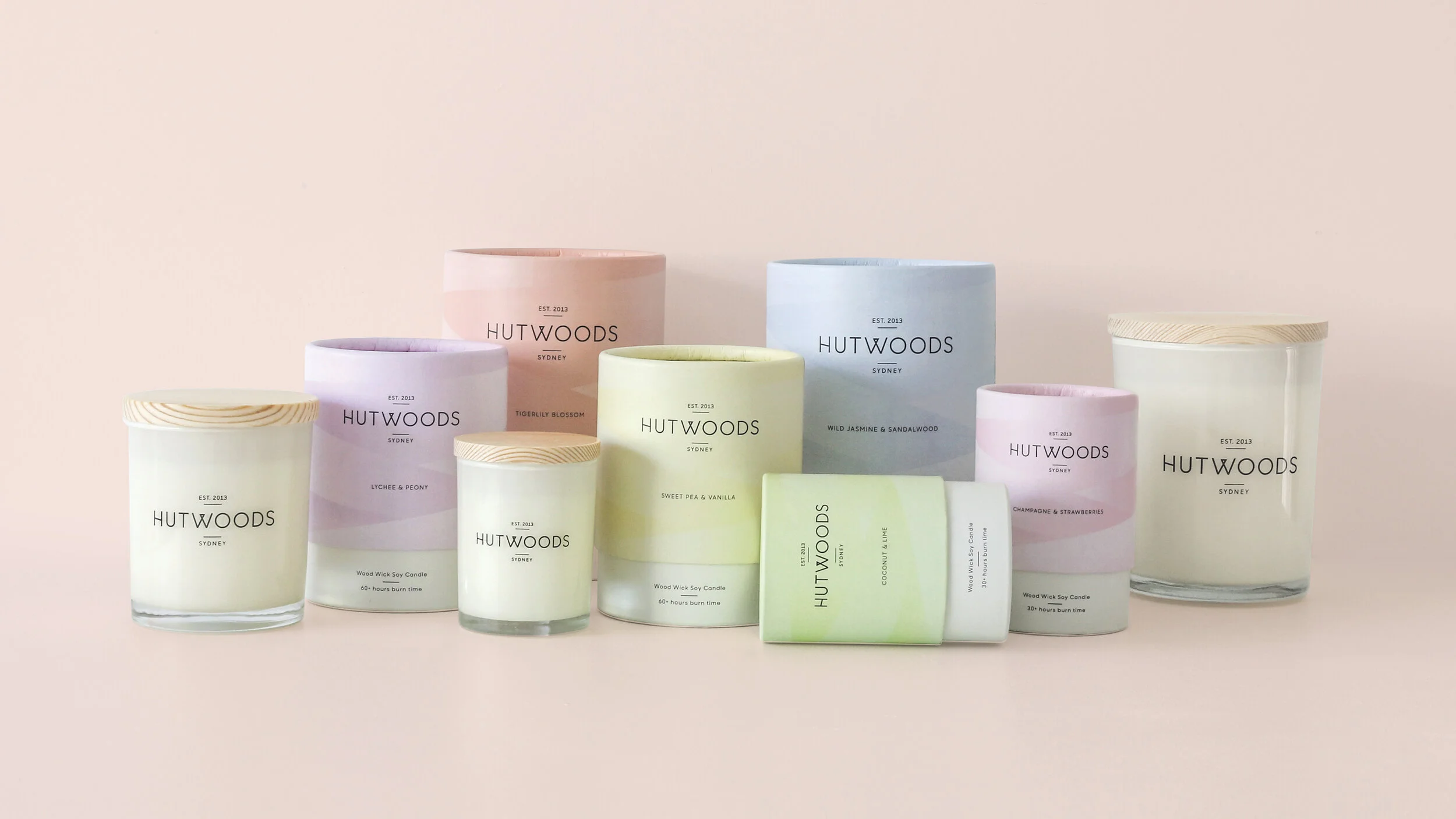
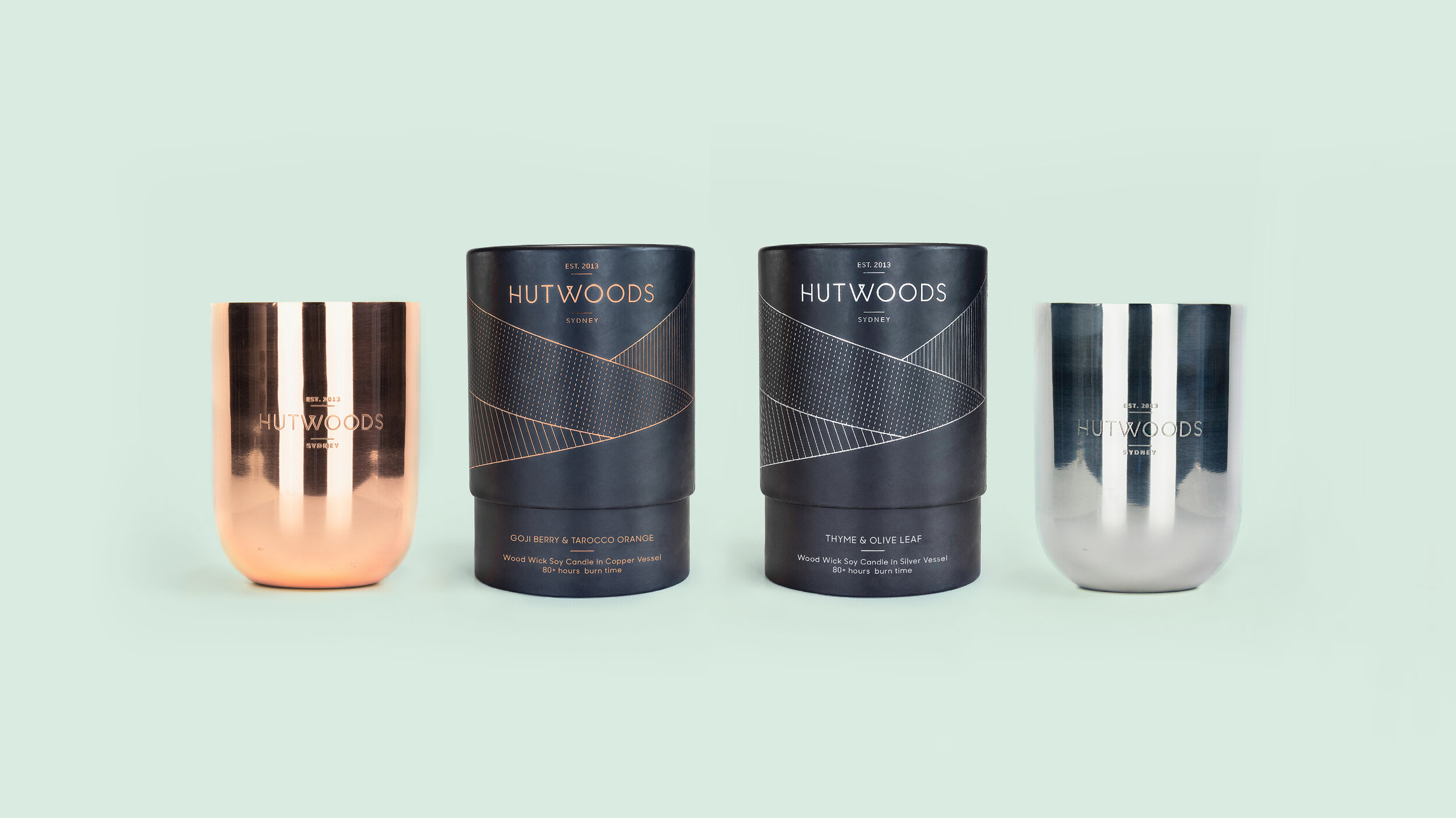
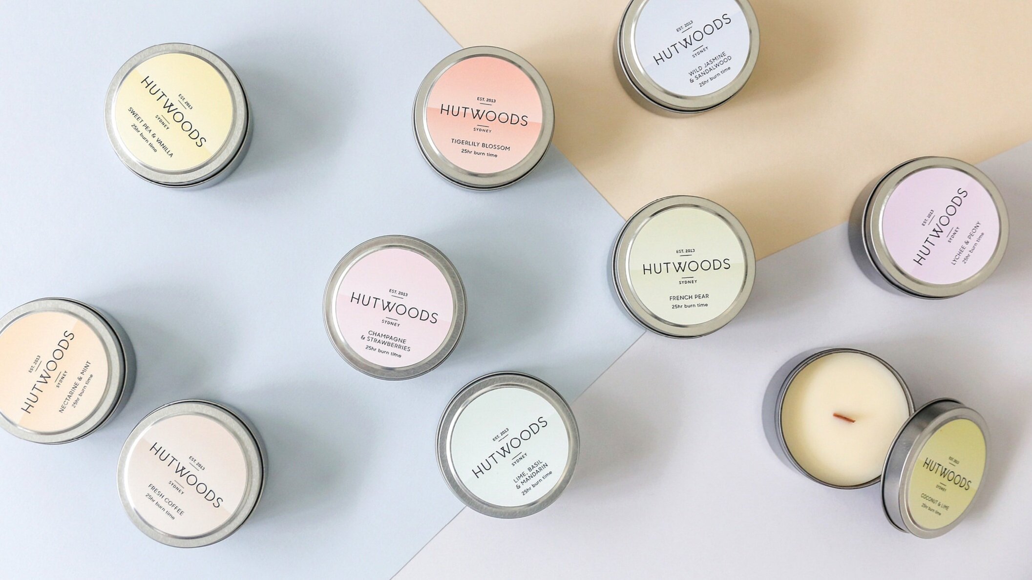
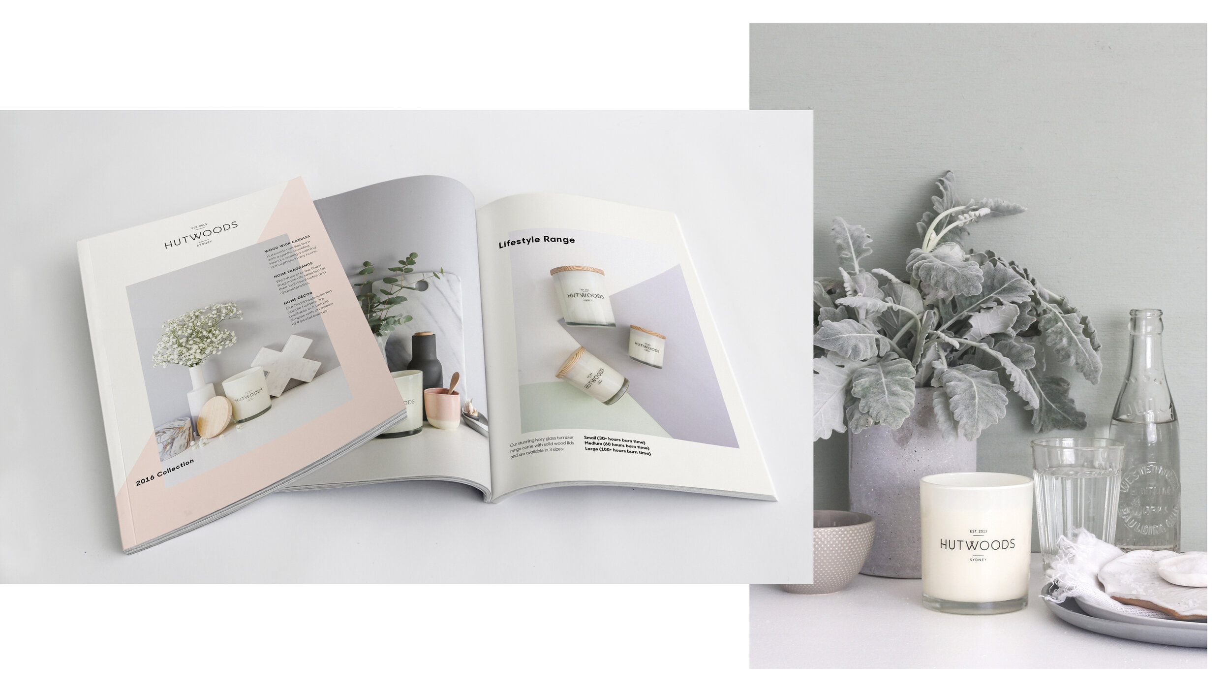
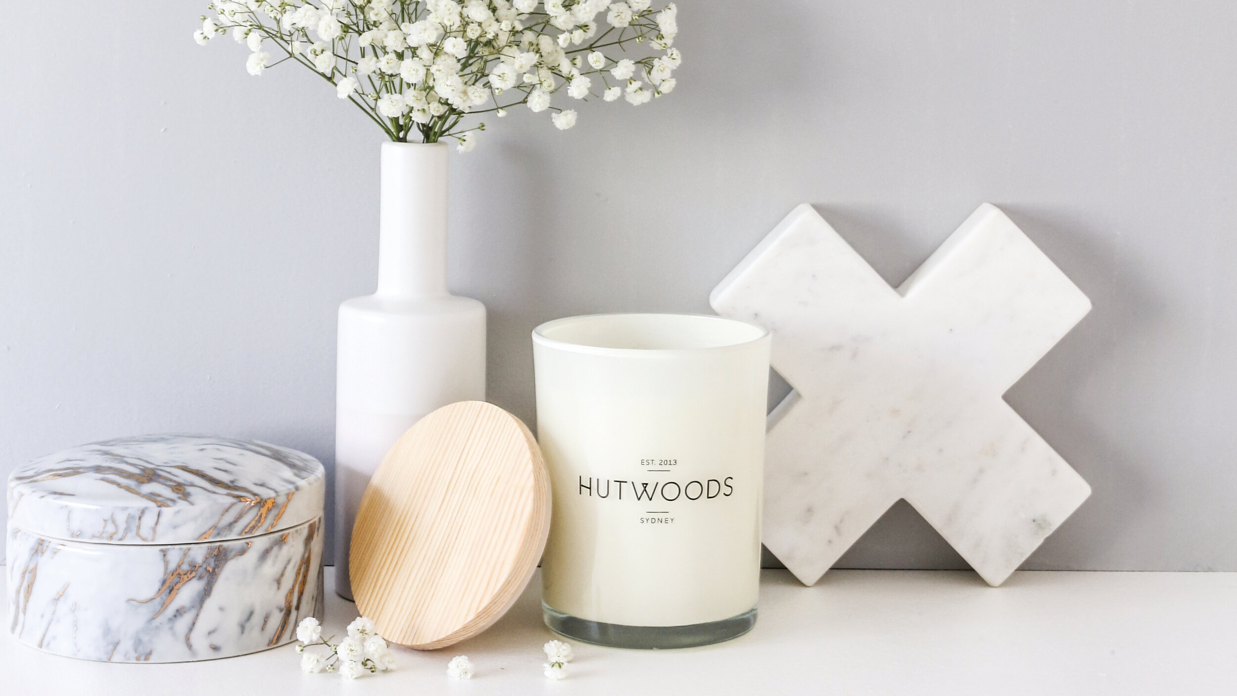
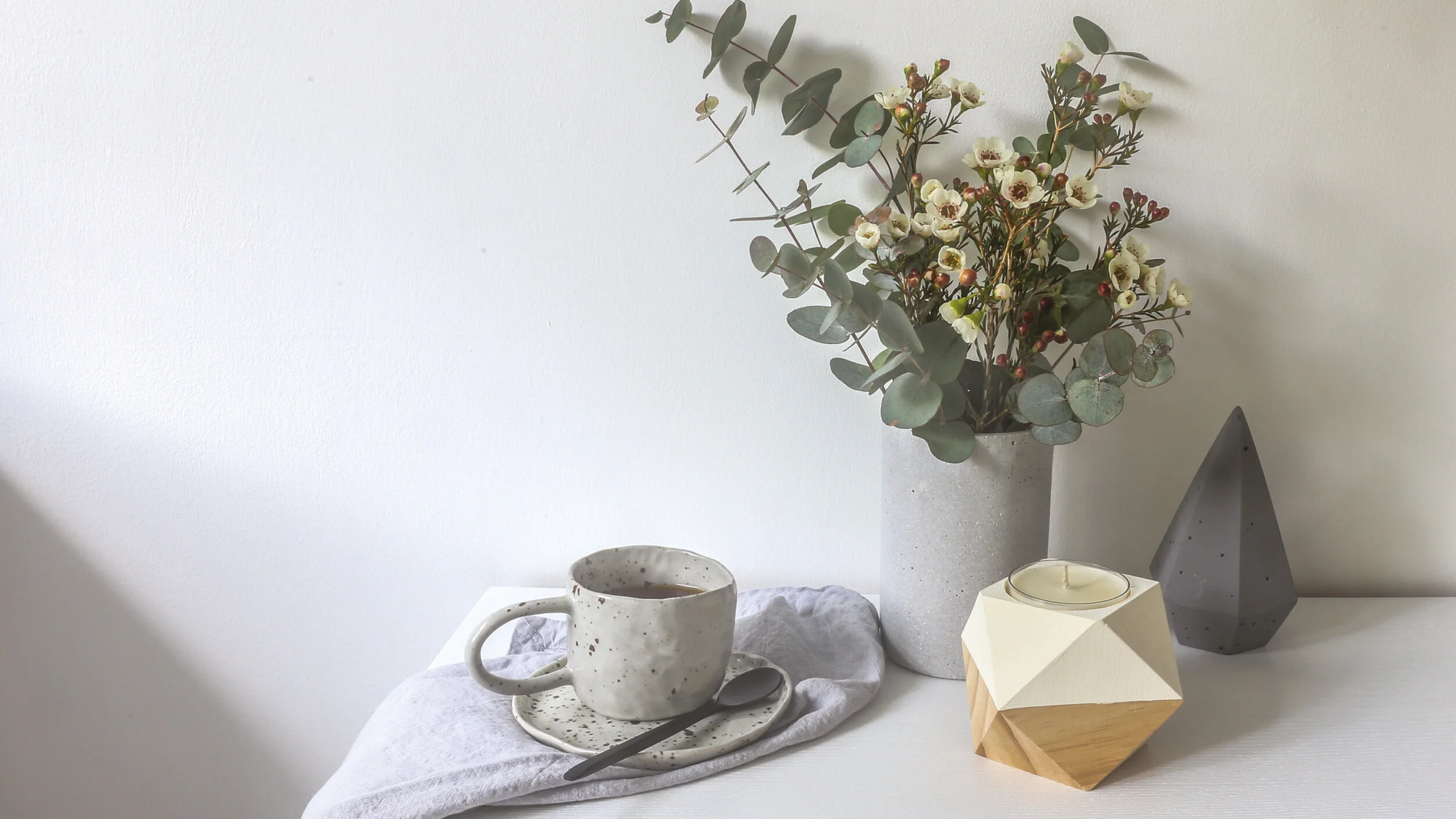
Knowing the Hutwoods wanted to be taken from a place of home-made craft to a place of refinement to gain more stockists, I came up with a solution that was classic yet modern. A sans serif font was redrawn to create a unique qwirk reminiscent of the wood wicks used in the Hutwoods' candles. The packaging was inspired by the fragments of light the candles cast and each fragrance influenced the colours, the result was geometric shards that wrap around the tube packaging. The backs of the packs outlined the emotional effect of each fragrance inspiring people to buy them for different occasions. The designs were flexible enough to evolve for the premium range too where the fragmented designs became fine keylines in foils, feeling distinctive, yet still on brand. The brochure art direction was simple and stylish showcasing the products in graphic ways but also lifestyle imagery that complemented one another.